Condo / Apartments
Houzz Tours
Houzz Tour: The House That Grew
A fortuitous discovery in this old apartment led to more design and spatial exploration

“The owners saw this house not as a ‘final and ideal’ home, but a ‘transitory’ home-space that was part of their upwardly-mobile aspirations. This played quite a key role in them placing value in being open to experimenting with the design, in both spatial and material finishing aspects,” says architect Liew Kok Fong of Studio Super Safari. As the apartment also reflected the age of the 18-year-old condo property, the owners sought a major revamp.
The demolition work revealed a surprising discovery when the old false ceiling was torn down. “We found an entire void space of almost a metre in height extending above the original perceived ceiling. We decided that there was new ‘room’ for part of the design to be changed in response to the additional headroom,” shares Liew. This chance finding prompted the team to nickname the project “The House That Grew”.
The demolition work revealed a surprising discovery when the old false ceiling was torn down. “We found an entire void space of almost a metre in height extending above the original perceived ceiling. We decided that there was new ‘room’ for part of the design to be changed in response to the additional headroom,” shares Liew. This chance finding prompted the team to nickname the project “The House That Grew”.
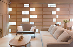
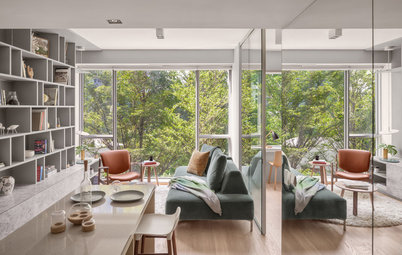
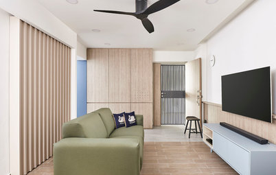
The space is airier and brighter with the dramatic new ceiling height and the apartment’s seamless connection to the outdoors.
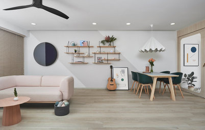
The pieces chosen for this open-concept space are testament to the owners’ keen eye for design. According to Liew, each piece of furniture that the couple chose come has a story – from the dining table that was picked out from etch&bolts after about a year of searching (the owners were very particular about the texture that they liked), to the dining bench from Foundry which was an extra piece from pews commissioned by a local church. The three-metre round rug is also a bespoke piece, given to them by a friend who runs a carpeting business.
The pieces chosen for this open-concept space are testament to the owners’ keen eye for design. According to Liew, each piece of furniture that the couple chose come has a story – from the dining table that was picked out from etch&bolts after about a year of searching (the owners were very particular about the texture that they liked), to the dining bench from Foundry which was an extra piece from pews commissioned by a local church. The three-metre round rug is also a bespoke piece, given to them by a friend who runs a carpeting business.
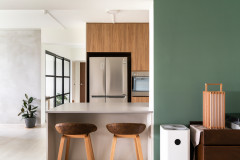
The new kitchen is demarcated by a bar counter that has concealed lighting underneath. The same teakwood used for the flooring is applied to the front of the counter in a chevron pattern. Glossy metal pendant lamps add mood, while emphasising the new ceiling height.
“Entering the kitchen, a sliding door closes into its pocket wall, doubling as a display glass for niched shelves fronting the dry counter,” says Liew.
“Entering the kitchen, a sliding door closes into its pocket wall, doubling as a display glass for niched shelves fronting the dry counter,” says Liew.
Despite its odd shape, the kitchen is efficient and stylish. Colourful contemporary Peranakan tiles cover the floor and off-white hexagonal marble mosaic tiles line the backsplash, bringing out the bluish-green colour of the laminate-finished cabinetry.
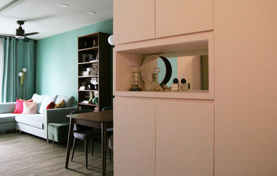
In between the living and dining areas is a door that leads to the private spaces. The corridor was made into a walk-in wardrobe with mirrored surfaces.
“While the walk-in-wardrobe still reflects an infinite display of mirrors and doors, unbeknownst to the person in the corridor is the expansion of space hidden above,” Liew says.
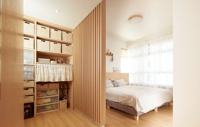
The same dark wood laminate finish from the corridor/walk-in wardrobe continues in the study. “A set of built-in furniture consisting of floor pedestals, study desk, wall shelves, and wardrobe multi-tasks as a flight of steps that take one up to the loft and storage space above,” says Liew.
In the loft, a pair of doors opens into a secret cubbyhole that sits above the walk-in wardrobe. This treehouse-effect gives a playful twist to the otherwise utilitarian nature of workspace and storage.
Next door is the bedroom (not pictured), which was designed to be a simple space for just the bed.
Next door is the bedroom (not pictured), which was designed to be a simple space for just the bed.
The bathrooms also display the apparent “bending of corners and blurring of edges, as if to make menial work less of a chore,” says Liew. In this bathroom, patterned tiles that clad the floor and wall bring drama to the utilitarian space.
The other bathroom, meanwhile, is simpler and more refined. One wall is accented by Japanese-inspired tiles and a backlit circular mirror, which make for a low-key contrast against the white marble floor and column pedestal sink.
TELL US
What did you find most striking in this home? Share in the Comments below.
What did you find most striking in this home? Share in the Comments below.

Who lives here: A young couple, both professionals and upwardly mobile
Location: City fringe
Size: 1,324 square feet (123 square metres)
Project duration: about 4 months
The wall running from the main entrance to the outdoor deck shows the ‘growth’. They opted to keep the expanse of un-plastered and exposed brick work, painting it in the same shade of white as the rest of the walls, to mark the original hidden void, initial ceiling and expanded height. “In a way, this became a detail or texture with a story to tell,” says Liew.
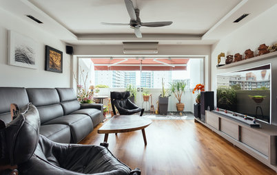
Another great feature of this apartment is that it is situated on the ground floor of the condo block, giving the feel of living in a ‘landed’ property. It opens out to an outdoor deck, and to the sounds of the surrounding water fountains and view of fellow residents, but remains screened off by the condo gardens.