Houzz Tours
Houzz Tour: A Bachelor Pad Draws Light In by Opening Up Spaces
Making the areas feel spacious was the main order of business for this 5-room flat

“The unit used to be very dim due to lack of natural light, too many dark wood furniture pieces, and a dark laminate floor. The walls were also in yellow, beige and brown tones that made the place look run-down,” says interior designer Kelvin Seow of Xin Concept. The priority, therefore, was to give the resale flat a new lease of life and create a peaceful haven for the bachelor to retire to following a long day at work and, at the same time, have plenty of space for entertaining.
“The first time I met the client, he outlined what he is looking to achieve in his new place: spacious, clean, airy, calm, and seamless. He collects toy figures, but is very disciplined in terms of storage. He doesn’t like the place to look cluttered,” shares Seow. The designer sought then to create a bachelor pad that emphasises a sleek and streamlined design.
“The first time I met the client, he outlined what he is looking to achieve in his new place: spacious, clean, airy, calm, and seamless. He collects toy figures, but is very disciplined in terms of storage. He doesn’t like the place to look cluttered,” shares Seow. The designer sought then to create a bachelor pad that emphasises a sleek and streamlined design.
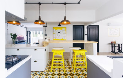
Bright pops of colour – yellow pendant lamps and red dining chairs – make for a vibrant complement to the subtle tones in the dining area. Adding visual interest here is a trio of prints, including a Mona Lisa dot art and a poster of the London Tube map, all framed in black for a uniform look.
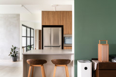
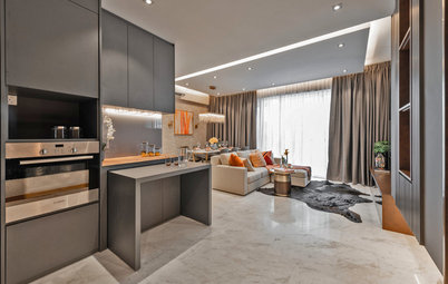
A glass door separates the kitchen from the living space. “The owner only does light, simple cooking so he wanted the kitchen to be kept clean-lined,” says Seow. To highlight the fuss-free, minimalist vibe, the honey-hued cabinetry was paired with black countertop and backsplash. The galley kitchen layout also affords a roomy feel and ease of movement when cooking and prepping.
A unique feature of this home is the concealed entrance to the master bedroom. “We tore down the wall that divides the master bedroom and living area so we can build a partition wall with pocket doors. This way, the master bedroom is cleverly hidden, providing additional privacy for the owner,” says Seow. “Once you enter the room, there are no additional doors, allowing a clean, spacious and seamless flow even into the open-concept bathroom.”
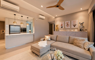
Soothing hues of green and brown envelop the master bedroom. The owner’s collection of figures dots the room and adds a personal touch.
“Since the owner lives alone, we also tore down the master bathroom wall in order to gain visual space,” Seow says. A drop in elevation gives the bathroom demarcation while still being connected.
TELL US
What feature did you like best in this home? Share in the Comments below.
TELL US
What feature did you like best in this home? Share in the Comments below.
Who lives here: A bachelor
Location: Clementi West
Size: 1,390 square feet (129 square metres)
Project duration: 2 months
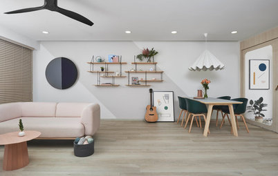
“The initial plan was to keep the walls white and combine them with light-toned wood furniture. But we started to have second thoughts along the way and asked ourselves, ‘are we being too safe?’,” says Seow. So the designer veered away from the original colour scheme. He decided to go for pale blue for the living-dining walls to contrast with the owner’s artwork and posters.
To bring in more natural light, the existing partition in the balcony was removed. It helped open up the space and expand the open-plan layout. Concrete-look homogenous tiles were laid throughout to achieve a seamless and spacious look.