Condo / Apartments
Houzz Tours
Houzz Tour: Cosmopolitan Meets Cosy in This High-Rise Home
Refreshing colours and luxe textures round up this flat's stylish yet homely style

“After six years of living in this penthouse, the owners were looking to bring back the magic they first experienced when they moved in. They’re both sophisticated, busy individuals, so they wanted a modern contemporary space that is both practical but warm and inviting,” says Caroline Chin-Geyler, head stylist of Arete Culture. Their kids are also slightly older now, so the owners thought it was about time to update the apartment.
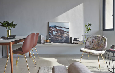
From the entryway, the home opens to the dining and bar area, which needed to be brightened up. The dark grey wall made the space look gloomy.
To create a relaxing ambience in the dining area, the colour for the accent wall was changed to dark blue. It’s a dramatic contrast against a sea of whites. A pair of ceramic lamps add mood lighting, while reflective surfaces, from the embellished artwork to the custom-built narrow console with shiny hardware help brighten up the area even more. “The space was left relatively simple and unadorned because we didn’t want to detract from the main event, which is the structure of the loft,” says Chin-Geyler.
The owners wanted to keep their dining table. “They don’t entertain often, so we felt the table would suffice. Its proportions also work well for the space as the goal was to keep the space feel as large and as uncluttered as possible,” she says. As replacement for the existing dining chairs, the team designed chairs (not pictured) that can be totally tucked under the table. This makes it easier to move around the table.
The owners wanted to keep their dining table. “They don’t entertain often, so we felt the table would suffice. Its proportions also work well for the space as the goal was to keep the space feel as large and as uncluttered as possible,” she says. As replacement for the existing dining chairs, the team designed chairs (not pictured) that can be totally tucked under the table. This makes it easier to move around the table.
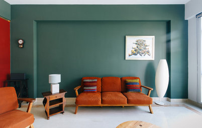
Despite having hefty pieces, the living area felt bare and lacked a warm and cosy feel.
“Because of the open concept, we felt that the key pieces all had to pull their own weight, so all the furniture were either chosen or built to be quite ‘statement-y’, but pared back in terms of colour,” says Chin-Geyler. To achieve the glamorous but understated look, they layered the space with different textures: glass, wood, soft fabrics and feathers.
Among the new pieces custom-built for this space are a midcentury modern-inspired TV console and a bar cabinet. “Charles used to own a bar for years so the family has many special bottles and a great selection of liquor. We customised a bar cabinet for them in a glossy white finish with shiny hardware – again to add that reflective element, as well as height to the space,” adds Chin-Geyler.
Among the new pieces custom-built for this space are a midcentury modern-inspired TV console and a bar cabinet. “Charles used to own a bar for years so the family has many special bottles and a great selection of liquor. We customised a bar cabinet for them in a glossy white finish with shiny hardware – again to add that reflective element, as well as height to the space,” adds Chin-Geyler.
Lightly-textured wallpaper adds subtle interest to the predominantly white walls, while various cushions and a large area rug soften all the hard, glossy surfaces. To tie all the colours in the living area together, Chin-Geyler commissioned artwork by White Emotions.
For added dynamism, the ceiling beams were painted blue. Various lighting sources complete the sensory experience.
Sofa: King Living; mirror: Ikea; coffee table: Arete Culture
For added dynamism, the ceiling beams were painted blue. Various lighting sources complete the sensory experience.
Sofa: King Living; mirror: Ikea; coffee table: Arete Culture
“This console is a sentimental piece for Charles. He wanted to keep it, but the size and the bright red colour just weren’t working for the space,” shares Chin-Geyler.
To keep it, the team shortened the table legs and gave the table a coat of blue paint to fit into the colour palette. It was also moved away from the window and placed against the angled wall. Its new location gives it the attention it deserves, and creates a nice spot for Charlie’s turntable. Furthermore, daylight now streams in more freely.
Going up the staircase gives a peek of the new sideboard in the entryway. Made of unfinished teak and adorned with mirrored drawers and silver hardware, it establishes the sophisticated feel from the get-go. The owners’ wooden mirror was also repurposed and transformed with a lighter stain for a more contemporary look.
This large potted plant was moved from the rooftop terrace to the staircase landing. It is placed on a pedestal embellished with mother-of-pearl and makes a refreshing statement.
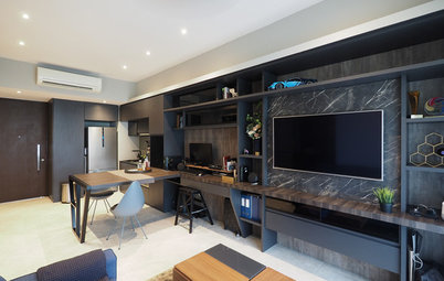
Dark-toned furniture and a large U-shaped desk made the study look cramped.
For the room to serve its dual function – as a study and as a guest bedroom for family and friends – the team ensured there was visual demarcation for both areas.
To enliven the living area, they chose a light brown sofa and a pale rug. The glass table – a piece that the couple wanted to throw out that has now been refurbished– makes for a practical piece in such a small space because it practically bears no visual weight.
To enliven the living area, they chose a light brown sofa and a pale rug. The glass table – a piece that the couple wanted to throw out that has now been refurbished– makes for a practical piece in such a small space because it practically bears no visual weight.
The open shelving, previously in dark wood finish, was also revamped to a white-and-wood palette. The whiteness blends in with the walls and helps add height to the space. A slimmer desk finished in the same two tones is pushed back against the windows, creating a more open walkway.
A dash of colour – in Pantone’s Colour of the Year, ‘Greenery’, no less – completes the relaxing vibe. “We used a lot of tropical greenery because the room is on the same floor as the rooftop terrace and we wanted to bring the outdoors in,” says Chin-Geyler.
A dash of colour – in Pantone’s Colour of the Year, ‘Greenery’, no less – completes the relaxing vibe. “We used a lot of tropical greenery because the room is on the same floor as the rooftop terrace and we wanted to bring the outdoors in,” says Chin-Geyler.
The girl’s room had basic furniture – a loft bed and cubby shelves. It needed re-organisation for her toys and added functional corners.
“Karen wanted a space for Maddie to grow into but we also wanted a room suitable for a young girl,” says Chin-Geyler. To create a versatile space while maintaining a youthful look, the team used the colours Maddie loves – pink and coral – and added grown-up elements like a pink and mint area rug, a copper table lamp, and an intricate mirror. An abstract artwork ties in all the colours in the room.
They also relocated the bed to create more play space. To address storage concerns, a layered storage system was put into place. The plastic tubs and baskets are within easy reach but also help hide clutter.
They also relocated the bed to create more play space. To address storage concerns, a layered storage system was put into place. The plastic tubs and baskets are within easy reach but also help hide clutter.
“We also knew Maddie would outgrow her furniture in a couple of years so we bought a simple, inexpensive study table from Ikea to give her a space to do her homework,” adds Chin-Geyler.
The boy’s room had the same loft bed. Decals on the walls and wardrobe doors gave the room personality, but the space needed better organisation, too.
“For William’s room we invested in more grown-up decor, such as rug, lamp and pouf, in trendy prints so they are fun and current but not too kiddy,” says Chin-Geyler.
The team replaced a small rug with this larger, printed one. It anchors the space and imparts vibrancy. The decals were removed and cubbies and baskets now serve as neater toy storage. Furniture was kept to a minimum to give him more space to move around.
The team replaced a small rug with this larger, printed one. It anchors the space and imparts vibrancy. The decals were removed and cubbies and baskets now serve as neater toy storage. Furniture was kept to a minimum to give him more space to move around.
The couple wanted an adult space for themselves.
The goal was to imbue the master bedroom with a hotel-like look. “We wanted the room to feel lived in and cosy, so the focus was on keeping things very simple and making things luxe with texture,” says Chin-Geyler.
The walls were decked in a reflective wallpaper in grey and beige, and cushions were kept to solid colours in different textures. “We didn’t use prints because we wanted to keep the look more understated,” she says. The old nightstands were also refurbished with paint.
The walls were decked in a reflective wallpaper in grey and beige, and cushions were kept to solid colours in different textures. “We didn’t use prints because we wanted to keep the look more understated,” she says. The old nightstands were also refurbished with paint.
A small seating area was created using a custom chaise longue and a floor lamp. The lamp adds height as well as a soft glow.
The powder room is used not just by guests but also by Charles and the kids. “We were mindful to only incorporate minimal decor that would be presentable to guests, unobtrusive for everyday use and, with the kids in mind, be unbreakable ,” says Chin-Geyler.
An open shelf hangs above the water closet for additional display and storage space.
TELL US
What feature did you like best in this home? Share in the Comments below.
What feature did you like best in this home? Share in the Comments below.

Who lives here: Charles and Karen, and their children William and Maddie, and dachshund Marley
Location: East Coast
Size: 3,127 square feet (290 square metres)
Project duration: 52 hours
As the couple is well-travelled and comes from culturally diverse backgrounds (the husband is originally from the US and has lived in Asia all his life, while the wife is from China), the team drew inspiration from cosmopolitan cities that reflect the owners’ sophisticated and dynamic outlook in life. “The theme [we chose] is a New York meets London loft feel – very urban yet understated luxe. We were inspired by two things: one, the layout of the space with the white walls, metal railings of the spiral staircase, the dark wooden floor, and high ceilings; and two, the couple’s extensive travel history,” says Chin-Geyler.