Condo / Apartments
Houzz Tours
Houzz Tour: Raw Meets Traditional in This Loft-Inspired Revamp
Though repair works messed up the initial design and increased the scope of work, the results are well worth it

Old homes always bring on unexpected surprises, and this resale walk-up apartment certainly came with a few. “Initially, the owners thought the house was move-in ready and only wanted to do the kitchen and bedrooms, but it soon became clear that a lot more work needed to be done,” says Arjan Nijen Twilhaar, principal designer of Aiden T, who was at the helm of this renovation.
“Often, buyers see that the place is being lived in and think that most areas are in good condition. But once the unit is emptied out, you can see the actual state, and with older units, the scope of work can drastically change,” he says. The team had to tackle fundamentals, including poor electrical wiring – which even started a small combustion, causing fire in one of the bedrooms – and a leaking sewage pipe from the unit upstairs. It was a good thing the designer and the homeowners were friends even before working together, so the discussion on the design was upfront and budget compromises were sorted out easily.
“Often, buyers see that the place is being lived in and think that most areas are in good condition. But once the unit is emptied out, you can see the actual state, and with older units, the scope of work can drastically change,” he says. The team had to tackle fundamentals, including poor electrical wiring – which even started a small combustion, causing fire in one of the bedrooms – and a leaking sewage pipe from the unit upstairs. It was a good thing the designer and the homeowners were friends even before working together, so the discussion on the design was upfront and budget compromises were sorted out easily.
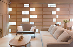
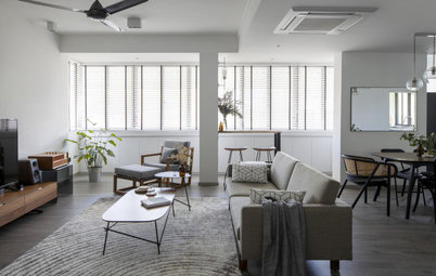
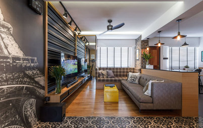
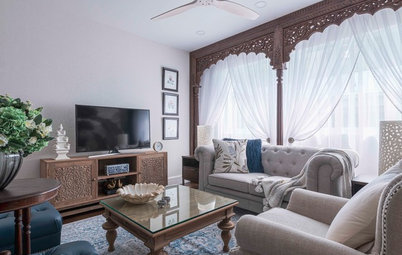
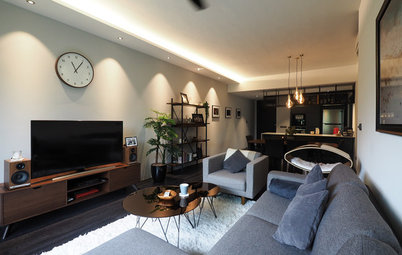
At first, both parties didn’t want to do much in the living room but after realising that major works had to be done, they decided to replace the original tile flooring with laminate flooring in a dark tone to add warmth.
They also discovered a structural pillar between the living space and the kitchen. “It made us rethink the overall design approach. We decided to leave the pillar raw to show the scarring after hacking and removal of the plaster,” Twilhaar explains. They took the raw concept further by stripping the plaster off the brick wall. Sealant was added to the red brick to give richness to the colour.
They also discovered a structural pillar between the living space and the kitchen. “It made us rethink the overall design approach. We decided to leave the pillar raw to show the scarring after hacking and removal of the plaster,” Twilhaar explains. They took the raw concept further by stripping the plaster off the brick wall. Sealant was added to the red brick to give richness to the colour.
“To balance the distressed look, we plastered the wall around the door and towards the windows, so there is crispness in contrast to the exposed brick. All the other walls were plastered smooth and we added tall wood skirting painted in white, to bring in a touch of the traditional,” he says.
To keep things streamlined, a new drop ceiling was added, and a support beam was boxed up. Twilhaar also selected a mix of mid-century modern furniture pieces in neutral colours, with flamingo-print cushions and vibrant accessories to brighten up the space.
Sofa and dining set: Commune; wood flooring: Hup Kiong; lights: Metalworks Sumatra
It was important for the designer to have some elements that are familiar and traditional. “I put in a lot of attention to certain finishing, such as the perimeter border around the living room flooring with a herringbone infill. These transit areas are important to add a level of sophistication and elegance. Even with a raw finish, there needs to be some parts that are polished and well-thought out,” he says.
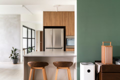
A lot of effort also went into space planning. The new design called for a larger kitchen with an island – as requested by the owners – so the team sacrificed a bedroom to give the kitchen a bigger footprint. “Planning the kitchen was crucial, as we pushed a lot of appliances, including a traditional range, into this space. Plumbing and electric work had to be carefully planned before tiling was done,” says Twilhaar.
Peranakan-inspired cement tiles, bordered by black tiles, make a dramatic statement in the two-tone kitchen. “Instead of black, which I feel is a bit too stark, we chose gunmetal grey and soft white. This combination makes for a much more elegant space,” he says. Multi-coloured barstools add a cheery vibe to the island seating.
Laminates: EDL; cement floor tiles: An Huat Trading; stools: Second Charm
The owners consider their kitchen to be the heart of the home. Twilhaar’s signature Shaker-style cabinets, finished in full laminate without any visible joint lines, were integrated into the design. “I had to make room for a washer/dryer, and I balanced that space with the fridge,” he adds.
A marble slab was installed for the backsplash, while plain quartz was chosen for the countertops. “I indulged in the ogee edge finish. It is a bit more costly to have this design detail, but it adds more character to the kitchen. Often, these are elements that are cut back on due to budget constraints, so I treasure the projects that allow me to execute my vision,” he says.
Range: Capitol; countertops: iQuartz
The owners put their own stamp on the space through a statement art piece in acrylic from YellowKorner. “In my renderings, I always add artwork in unusual places and often, owners don’t pick up on the cue. But it works so well to have art in a utilitarian space like a kitchen, because it brings colour and interest to the space,” says Twilhaar.
Some antique furniture pieces, such as these console tables with intricately carved details, are interlaced into the mix. They add more stylish flair to blank corners. Knick-knacks from the owners’ travels pepper the home as well.
All the interior doors were changed to barn-style doors, while the woodwork was kept in crisp white. The wall in the hallway to the bedrooms was painted in a stone grey colour, to accentuate the passage while still harmonising with the home’s neutral palette.
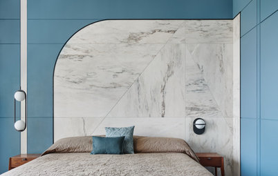
Warm-hued walls create a calm and relaxing backdrop for the streamlined furnishings in the master bedroom. “The same floor tiles are carried through, but laid in a parquet pattern. The border tile offers a wonderful transition between the hallway and the bedrooms,” says Twilhaar. And like in the entertaining spaces, the owners’ selection of cushions add a touch of colour and personality to the room.
Doing away with one bedroom also enabled the team to make the bathrooms bigger, which was another major consideration for the owners. The couple, however, wanted different things for the bathrooms. “One partner wanted a more contemporary looking bathroom with the hexagon tiles. The other picked a more industrial look with subway tiles. I married the styles by picking colours that came together and creating cohesiveness,” Twilhaar says.
Hexagon tiles in various tones, laid out randomly to create an ombre effect, became the feature in the master bathroom’s shower cubicle. The earthy look is enhanced by the wood-grained finish of the vanity, as well as the plants. The ogee edge quartz countertop brightens up the space.
Tiles: Rice Fields; countertop: iQuartz
Meanwhile, the common bathroom sports a more industrial look. “We picked a subway tile with an irregular finish and added a contrasting border. In the dry areas, we installed the tile up to only 1.8 metres and plastered and painted the space above it. It helps soften the look,” says Twilhaar.
Subway tiles: Hafary; Singapore-themed prints: Eck&Art Designs
Subway tiles: Hafary; Singapore-themed prints: Eck&Art Designs
The owners hung graphic posters with local content for added visual interest.
It certainly helped that the designer and the owners had great chemistry together because it paved the way to creating a truly personalised home. “The owners have a great sense of style and a wonderful sense of humour that shows their personalities,” says Twilhaar. “That is why I opted to create a blank canvas for them to show their creativity through the artworks and accessories that they pick.”
TELL US
What did you find most striking about this home? Share in the Comments below.
Houzz at a Glance
Who lives here: A cross-cultural couple
Location: Joo Chiat Lane
Size: 1,300 square feet (120 square metres)
Project duration: 3 months
“The brief was less of a design direction and more of the elements that they both love,” shares Twilhaar. The owners, who love to entertain and cook, specified a Shaker-style kitchen, cement tile floor, and black grid glass. “Combining these elements together, I came up with a traditional loft style design – straddling raw and exposed details with more polished and elegant design features.”
Twilhaar was inspired by the lofts in New York’s Meatpacking District. “They have an element of rawness that gives a masculine look, but there are also traditional elements to soften the design,” he says.