Condo / Apartments
Houzz Tours
Houzz Tour: A Petite Penthouse Gets a Glam Update
Layered touches juxtaposed with dark colours make for a modern luxe setting

Although the couple who owns this penthouse are seldom home as they frequently travel for work, they didn’t scrimp on the design details in their abode. After all, it’s where they kick off their shoes and relax after work. “They prefer a maintenance-free lifestyle because they spend most of their time at home chilling out,” says designer Kate Ng of Design Neu.
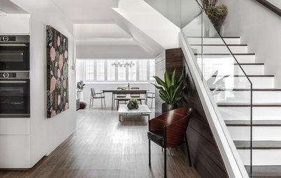
But the space didn’t come without challenges. “The existing floor plan had a narrow entrance, an enclosed small kitchen, and a squarish living area which could barely fit a four-seater dining set. The design and space planning took us about two months before construction,” Ng shares. Through carefully considered reconfiguration of spaces and selection of finishes, the home now exudes the posh yet cosy look that the owners sought for.
But the space didn’t come without challenges. “The existing floor plan had a narrow entrance, an enclosed small kitchen, and a squarish living area which could barely fit a four-seater dining set. The design and space planning took us about two months before construction,” Ng shares. Through carefully considered reconfiguration of spaces and selection of finishes, the home now exudes the posh yet cosy look that the owners sought for.
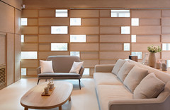
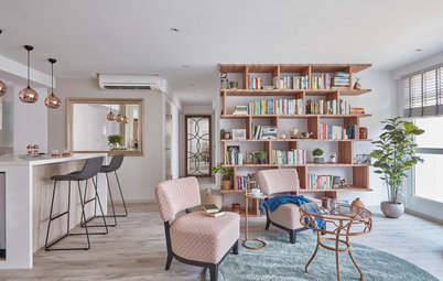
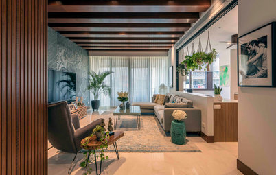
“The previously-unbalanced interior spaces were connected to create effective storage more through carpentry work than solid walls,” Ng says. The designer proposed an open plan for the communal area to achieve lots of entertaining and interaction space for family and friends.
Ng also created a see-through feature wall between the living area and the staircase using black powder-coated metal strips. “It is designed to make the living space look bigger,” she says.
Ng also created a see-through feature wall between the living area and the staircase using black powder-coated metal strips. “It is designed to make the living space look bigger,” she says.
Since there wasn’t enough space in the main living area for a dining set, they opted to situate the dining table at the balcony. This also made way for a more spacious living area.
“The interior design of the penthouse exhibits a lavish use of materials on feature walls, ranging from luxuriously-finished tiles to metal, blackened mirror to elegant woodgrain,” explains Ng. The colour palette was also kept to dark shades for a sophisticated look. The goal was to emphasise a cosy ambiance.
Sofa: Cellini
The feature wall in the living area features 3mm-thick leather-look tiles from Rice Fields.
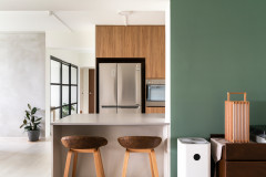
Grey tiles delineate the kitchen and bar area. To maintain continuity in the dark-toned cabinetry, the fridge was built-in beside the bar display. “Marble-look tiles were selected for the countertop in order to blend with the liquor display collection,” she says.
The designer opted to keep the existing glossy white and wood laminate cabinetry in the kitchen. To create subtle contrast within the monochrome palette, she picked out a grey stone-like finish for the new cabinetry and bar countertop. Copper pendant lamps add a touch of sparkle to the space.
Bar stools: Comfort Design; pendant lamps: Teak and Mahogany; tiles and countertop: Rice Fields
Bar stools: Comfort Design; pendant lamps: Teak and Mahogany; tiles and countertop: Rice Fields
Another major reconfiguration of space was the transformation of the two bedrooms on the first level into a master suite. As with the entertaining spaces, there is a play of light and dark shades to complement the dark wood parquet flooring, and bring about a restful atmosphere.
Since the study and common bedroom were merged to form the master bedroom, the designer was able to extend the existing master bathroom. To maximise the space, the designer proposed a double vanity to give the couple the ‘hotel look’ that they wanted.
A large mirror coupled with warm lighting visually expands the space. Little niches for toiletries and accessories keep the vanity area uncluttered.
Tiles: Rice Fields; bath accessories: Grohe
A large mirror coupled with warm lighting visually expands the space. Little niches for toiletries and accessories keep the vanity area uncluttered.
Tiles: Rice Fields; bath accessories: Grohe
A tinted glass door from the bathroom leads to the walk-in wardrobe. Glass doors were also chosen for one side of the wardrobe, for easy viewing of clothes while still maintaining a neat look. The other side with opaque doors is for general storage.
The original master bedroom on the second level is now a study-cum-guest room. “The customised double bed concept caters to family members who sleep over,” says Ng.
The balcony in the second level was specially designed for those occasional dinner parties with family and friends. A mini kitchen was built to make preparation and cleaning more convenient.
TELL US
What is your favourite space in this home? Share in the Comments below.
TELL US
What is your favourite space in this home? Share in the Comments below.

Who lives here: Nicholas and Jeannie
Location: Pasir Panjang
Size: 1,561 square feet (145 square metres)
Project duration: 2 months
Stepping into the home, an overall air of contemporary chic is immediately evident in the narrow entryway through a layering of dark tones and luxurious finishes. Cute decor adds a personal, playful element to the space.