Condo / Apartments
Houzz Tours
Houzz Tour: A Seven-Year-Old Apartment's Stylish Update
Minor tweaks in the floor plan and a striking palette gave this home a new lease of life

“Crafting spaces that felt exquisite and chic was our main objective when we were engaged by the clients to design the interior of this apartment,” says Tan Cher Ming, Ming Architects‘ principal architect, who worked with co-designer Erica Chan for this renovation. The three-bedroom condo flat was bought bare and generally in good shape, which made the renovation a straightforward process.
The owners, who are busy individuals in the law industry, have a good eye for design and were involved throughout the entire process. After a series of design discussions, the team went with a contemporary chic theme with mid-century modern influences, where bold colours are complemented by softer tones and materials such as brushed metallic accents. “Intended as a reflection of the lifestyle of its owners, the renovation conceived a home that balances warmth and urban living, without feeling excessively ‘designed’,” says Tan.
The owners, who are busy individuals in the law industry, have a good eye for design and were involved throughout the entire process. After a series of design discussions, the team went with a contemporary chic theme with mid-century modern influences, where bold colours are complemented by softer tones and materials such as brushed metallic accents. “Intended as a reflection of the lifestyle of its owners, the renovation conceived a home that balances warmth and urban living, without feeling excessively ‘designed’,” says Tan.
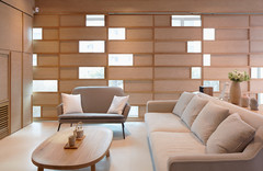
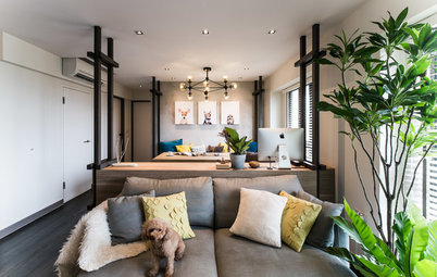
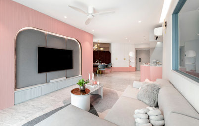
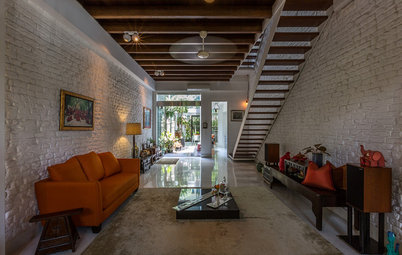
Painted a bold shade of dark blue-grey, the feature wall in the living area stands out from the otherwise neutral interior. It also frames the TV console unit and the large flamingo artwork, which was chosen by the wife. “The custom-made console unit features a copper support structure and stained timber shelves, establishing a good mix of masculine features and subtle feminine details, which is apparent throughout the house,” says Tan.
The living area also extends to the balcony where the owners can enjoy the outdoor space while looking over the swimming pool and other amenities.
The team also built additional cabinetry fronting the household shelter, in order to conceal the new distribution board (DB). “We relocated the DB to this new position as it was taking up too much space. The new location allowed us to shift the position of the ovens and fridge, as well as the washing machine in the wet kitchen, increasing the usable space greatly,” explains Tan.
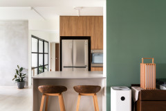
The dry and wet kitchens enjoy a visual and light connection, thanks to a glass door that separates the two areas. Hexagonal Carrara marble tiles used for the dry kitchen backsplash create textural interest against the glossy cabinet fronts, and at the same time, complement the black quartz countertop that flows seamlessly into the wet kitchen. “The design of the dry kitchen is balanced with the use of neutral coloured carpentry with copper accents,” says Tan.
In contrast, the utilitarian wet kitchen features sleek stainless steel carpentry and black back-painted glass backsplash.
This space used to be the service yard, which the designers deemed unusable because of its tiny footprint and an awkward placement of a basin in the middle of the space. They then decided to retile the space and create a new enlarged wet kitchen. Overlooking the lush greenery, it also doubles as a secondary dining area and chill-out spot.
This space used to be the service yard, which the designers deemed unusable because of its tiny footprint and an awkward placement of a basin in the middle of the space. They then decided to retile the space and create a new enlarged wet kitchen. Overlooking the lush greenery, it also doubles as a secondary dining area and chill-out spot.
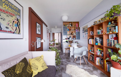
One room that was also overhauled was the study. A custom-designed full-height bookshelf lines one wall, providing the owners plenty of storage for their books, knick-knacks, and liquor collection. A cosy reading-cum-lounging alcove was fitted into the area, and walls were also given a fresh coat of dark-coloured paint to emphasise the intimate ambience.
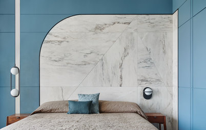
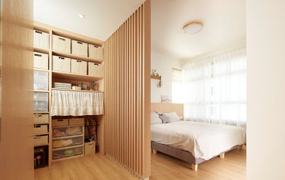
For the bedrooms, which were in quite good condition, the designers only renovated the wardrobes and flooring. “The timber flooring in the bedrooms was stained much darker to suit the entire look of the house,” says Tan. The owners kept to the neutral palette, and accentuated the spaces with metallic tones and globe-shaped lamps.
A nod the mid-century modern style, furniture throughout the house feature tapered legs attached at an angle as seen in this bedside table.
While the existing marble floor and walls were retained due to budget constraints, the designers ensured that the master bathroom was made more functional and airy. New mirrored cabinets and a floating vanity counter opened up the space, with a combination of generous daylight and accent lighting to enhance the inviting ambience.
TELL US
What did you like best in this home? Share in the Comments below.
TELL US
What did you like best in this home? Share in the Comments below.
Who lives here: A couple in their mid-30s
Location: Bukit Timah
Size: 1,658 square feet (154 square metres)
Project duration: about 6 months
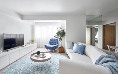
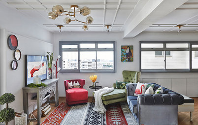
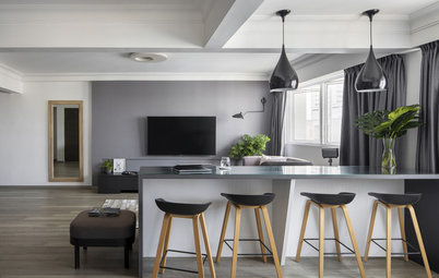
From the entrance, the open-plan layout gives a sweeping view of the living and dining areas, as well as the kitchen. The designers opted to retain the original Volakas marble flooring, which lends subtle elegance to the entire space.