Condo / Apartments
Houzz Tours
Houzz Tour: Styles of the Past, Present & Future Live in This Apartment
A line of arches in this walk-up apartment stayed and took on a pivotal role

Working with old homes can be a disaster or a delight. It so happens that Victor Ting and his team at The Carpenter’s Workshop had the pleasure of working on this 31-year-old apartment’s overhaul. The resale unit is not only well-lit and spacious, it is defined by a passageway of arches which demarcates different living zones. While some consider these structural elements a bane as it cannot be removed to free up more space, the designers thought of it as a bonus. Ting says: “Retaining the arches is akin to keeping a portion of an architecture that belonged to the past. These same arches remain both as a witness to the passing of time as well as a participant in the contemporary living of this city.”
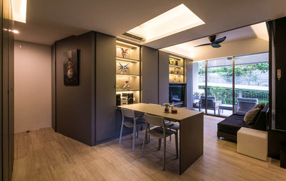
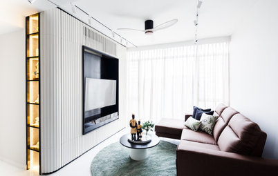
Arches aside, the configuration of the home is unlike any other. Taking note of the openness of the elongated area next to the balcony, the designers felt that the setting and size was suited to house long tables for the study and dining area. The living area was then delegated to a squarish space towards the back of the house, where a darker and cosy ambience takes over.
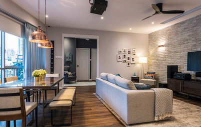
Natural light pours in from the balcony and shines the spotlight on the homeowners’ eclectic mix of furnishings amassed over the years. This explains the mismatched dining and study furniture. By establishing a neutral-coloured setting of white walls, cement flooring and tons of daylight, there’s visual breathing space for the disparate furnishings to gel harmoniously.
Shelving along the passageway of arches bring visual depth and functionality to the small area behind the arches while decorative accents and reading materials lend colour and personality to the whitewashed area.
Wedged between the dining area and kitchen, the cosy living area is framed by an interesting and layered background of archways. The curves are echoed by the Flos Arco Floor Lamp while the streamlined furnishings bring a modern contrast.
The distressed texture of the exposed brick wall was achieved by applying cement in liquid form over the wall. To complete the look, the designers used cast concrete slabs for the TV console and cement flooring as well.
Enclosed by glass sliding doors, the kitchen presents a refreshing change of scene with its modern monochromatic style. As explained by the designers: “The kitchen needed to be functional as the homeowners cook quite often.” The modern and storage-friendly kitchen with a long and fully-equipped island unit fits their needs perfectly.
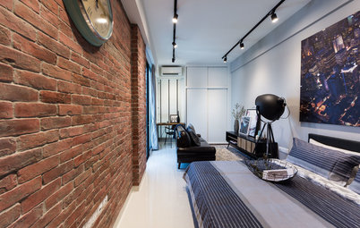
Step aside, faux brick walls. This red brick wall is the real deal and it bestows warmth and nostalgia to the master bedroom which complements the old school archway to a tee. To keep the red bricks from disintegrating, a coat of lacquer was applied over its surface.
Expanding the master bedroom worked out well as the new wing lets in more light. This newly-merged adjacent room has also been transformed into another wardrobe space. The designers say: “We suggested that the wardrobe space be broken up into a conventional enclosed wardrobe in the master bedroom and another section to be open racks.” As unusual as this home’s configuration gets, the highlight lies in how everything old, current and new come under one roof.
The team sums it up succinctly: “The past (the arches), the present (the existing furnishings) and the future (a blank canvas that allow future enhancement) converge in this place. There is continuity from the past and a progression into the future.”
TELL US
What do you find most striking about this home? Let us know in the Comments section.
Who lives here: A married couple and their three young children
Location: Walk-up apartment in Bukit Timah
Size: 278 square metres (3,000 square feet)
It goes without saying that the arches have been worked into the proposed design. The homeowners favour the natural and pared-down aesthetics of exposed cement walls and raw wood beams which nicely complement the nostalgic-looking archways. By creating a neutral landscape of clean-cut materials, the designers were also able to fulfil another of the homeowners’ design requests. Ting says: “They have a collection of furniture gathered through the years. One of their expectations was for a part of their home to become a canvas and a ‘work in progress’ where they can add more items over time.”
“In a sense, they wanted a living, evolving and dynamic space that grows with the family.”