Condo / Apartments
Houzz Tours
Houzz Tour: This Compact Condo Embraces Its Unconventional Layout
Creative space allocation and smart storage make this family home seem larger than it really is

Lester Goh, the architect-owner of this three-bedroom unit, set out to overcome the typical yet all-important concern faced by new homeowners like him and his family: budget and space constraints. “The layout of this unit was rather unconventional. It had a designated, sizeable dining area but it was separated from the living area, which made the living space perceptively smaller. Conceptually, the kitchen and dining area form a T-shaped layout with the living area,” he explains.
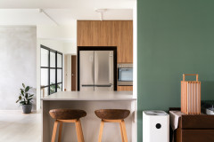
Stepping into the unit, guests are greeted by the kitchen to the right and the dining area to the left. Since both like to cook, they decided that the kitchen had to be the heart of the home.
To compensate for the limited length of the existing kitchen counter, Goh opted to increase its depth, creating the effect of an island counter. Removing the kitchen walls allowed the island counter to be extended to a generous 110 centimetres deep, which is roomy enough for pastry making and for functioning as a buffet table for dinner parties, he says. He also planned the kitchen layout to accommodate a side-by-side fridge and a one-and-half bowl sink.
To compensate for the limited length of the existing kitchen counter, Goh opted to increase its depth, creating the effect of an island counter. Removing the kitchen walls allowed the island counter to be extended to a generous 110 centimetres deep, which is roomy enough for pastry making and for functioning as a buffet table for dinner parties, he says. He also planned the kitchen layout to accommodate a side-by-side fridge and a one-and-half bowl sink.
A marble-finish backsplash adds a touch of luxe to the kitchen. “Instead of real marble, which is expensive and difficult to maintain, we used large slabs of homogenous tiles with marble veining. Cheaper and better!” says Goh. He chose off-white acrylic solid surface with light veining for the countertops and light-toned laminate for the cabinetry to enhance the openness of the prep and cooking area.
Inspired by the communal tables they saw at cafes in Melbourne – “tables large enough to perform shared activities like eating and working at the same time” – Goh managed to fit an eight-seater oak table with a custom-designed storage bench. There is even room to spare for a coffee/liquor bar against the wall, as well as more shelving. The back-to-basics feel of the dining area ties the simplicity of the design together with their effort to lead a healthier eating lifestyle, he adds.
“I also spent considerable time tracking down lights inspired by the Bernard-Albin Gras lamps, which were the favourite working lamp of the great modernist architect Le Corbusier,” he shares. “The lamp design has a good balance of function and aesthetics, as the lamps can be angled accordingly.”
“I also spent considerable time tracking down lights inspired by the Bernard-Albin Gras lamps, which were the favourite working lamp of the great modernist architect Le Corbusier,” he shares. “The lamp design has a good balance of function and aesthetics, as the lamps can be angled accordingly.”
Goh observes that most open kitchens look messy due to the random placement of essential items like the rice cooker and kettle. Thus, he ensured that everything in their kitchen has its own designated place. He also maximised every inch of storage space, including concealed units to keep certain items out of sight, such as this semi-open shelf for cookbooks and magazines.
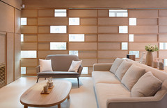
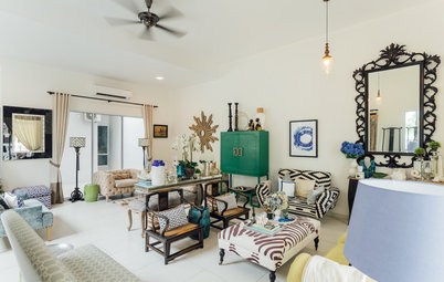
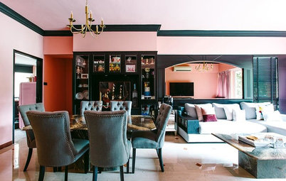
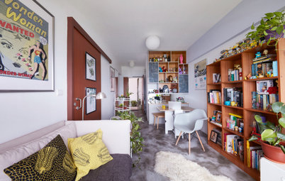
An eclectic mix of furniture and accessories – a creased cowhide sofa, rattan armchairs, a driftwood floor lamp with a furry shade, and a Union Jack-inspired area rug – makes the living area cool and casual. “I was looking for a place to hang my guitar that is out of reach from my toddler, so I turned this nook in the living area into a music studio of sorts, similar to those spaces you can find in charming old lofts,” Goh says. The veneer brick finish adds a rustic charm.
Another notable feature is the subtle yet creative manner in which the large TV is hidden inside the cabinet. “As the original living space was rather square, I decided to create variety by integrating the TV cabinet with an angled laminate wall, and a false ceiling which was slanted to ‘guide’ the visitor to the living space. This also serves to balance out the horizontality of the dining and kitchen space,” he says.
Another notable feature is the subtle yet creative manner in which the large TV is hidden inside the cabinet. “As the original living space was rather square, I decided to create variety by integrating the TV cabinet with an angled laminate wall, and a false ceiling which was slanted to ‘guide’ the visitor to the living space. This also serves to balance out the horizontality of the dining and kitchen space,” he says.
The common bathroom’s compact space proved to be a challenge, especially since it is bound by structural columns. “The scale and design of the toilet needed to appeal to both child and adult and at the same time not intimidate the child as he practices toilet independence,” Goh says.
To achieve this, the original swing door was replaced with a sliding door. A smaller but longer sink was installed, and an opening was carved out in the under-counter cabinet so the toddler can learn to tuck away his own soiled clothes.
To achieve this, the original swing door was replaced with a sliding door. A smaller but longer sink was installed, and an opening was carved out in the under-counter cabinet so the toddler can learn to tuck away his own soiled clothes.
The master bedroom is decidedly minimalist with its clean palette and sparse furnishings. With careful planning, the owner also managed to maximise the space and build his-and-hers wardrobes.
TELL US
What is your favourite feature in this home? Share in the Comments below.
What is your favourite feature in this home? Share in the Comments below.

Who lives here: Owner and designer Lester Goh, his wife Lydia, their son, and a helper
Location: Dawson Road
Size: 87 square metres (936 square feet)
Project duration: 3 months
Instead of taking the usual path of removing bedroom walls to create a larger communal space and switching out the existing wall colours and floor tiles – both of which can add significant costs – he opted to keep the existing layout and finishes and simply complement them “by using materials that would uplift their perceived look and feel.”
There was also a conscious effort to make the home child-friendly and future-ready, as well as to emphasise the couple’s preference for a casual aesthetic. This is largely influenced by homes and cafes in Melbourne, where he and his wife studied for several years.