Interior Design
Orange You Glad for These Designer Ideas on Using this Hue?
It's been said that orange is a polarising colour – love it or leave it – so here are some ways to get it right

The Russian artist Wassily Kandinsky said: “Orange is red brought nearer to humanity by yellow.” It’s certainly more down-to-earth and easy to live with, despite the symbolic association we have of mandarin oranges and gold nuggets, or the elusive Hermes bag in its trademark colour.
Orange evokes different meanings: happiness, harvest and harmony, to name a few. If you’re looking for a fresh yet warm colour to decorate with, this juicy hue’s for you.
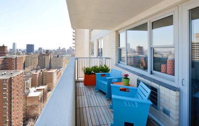
1. Use it sparingly
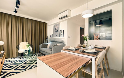
When using a supersaturated orange as an accent colour, a light touch is all you need. Add it to a neutral palette for a vibrant burst of energy, such as this chair in the white-and-wood hallway.
When using a supersaturated orange as an accent colour, a light touch is all you need. Add it to a neutral palette for a vibrant burst of energy, such as this chair in the white-and-wood hallway.
2. Or don’t hold back
A small room, like a powder room, becomes a stunning space when you pump it up with a bold colour. The orange fills it up with a visual warmth, and contrasts with white bathroom ceramics dramatically.
A small room, like a powder room, becomes a stunning space when you pump it up with a bold colour. The orange fills it up with a visual warmth, and contrasts with white bathroom ceramics dramatically.
3. Pair it with food
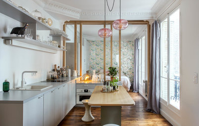
Food-related spaces, like the kitchen or dining room, that is. As a naturally occurring hue in food, orange has the amazing gift of making food look fresh! Plus, it’s an appetite-stimulating colour.
See more food-inspired colours for the kitchen
Food-related spaces, like the kitchen or dining room, that is. As a naturally occurring hue in food, orange has the amazing gift of making food look fresh! Plus, it’s an appetite-stimulating colour.
See more food-inspired colours for the kitchen
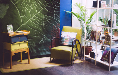
4. Work some pink in to tone it down
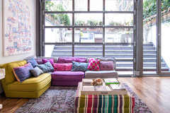
Somehow the combination of pink and orange makes the two colours easier on the eye. Together they recall lush silk furnishings in exotic tropical villas. Look for them in patterns to make them work in smaller spaces like apartments.
Somehow the combination of pink and orange makes the two colours easier on the eye. Together they recall lush silk furnishings in exotic tropical villas. Look for them in patterns to make them work in smaller spaces like apartments.
… You can also brighten up the orange-and-pink combo with a splash of yellow, topped with some gold, for a super-chic, contemporary feel.
Read about this living room
Read about this living room
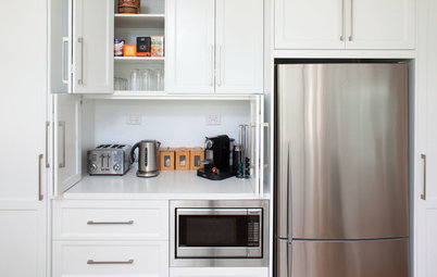
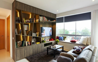
5. Work it as the focal point in a light, neutral space
Whether with soft furnishings, a piece of furniture (or two, like in this study)…
Whether with soft furnishings, a piece of furniture (or two, like in this study)…
… or niches that visually pop out of a wall of cabinets, orange draws the eye towards it with a warm smile.
Read about this home
Read about this home
6. Use carefully with black and grey
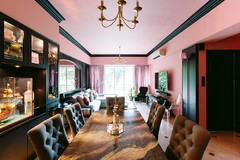
Few people can get away with this combination without making it look like Halloween. The key for the living room above is the smallest amount of muted orange, and the greater presence of prints and textures.
Few people can get away with this combination without making it look like Halloween. The key for the living room above is the smallest amount of muted orange, and the greater presence of prints and textures.
… while in this bedroom, grey and white ensure that the warmer, bolder orange stays away from Halloween territory.
Tell us
Do you like orange? How do you use it in your decorating? Share or post a photo in the Comments section!
More
How to Decorate With Orange
See more orange ideas
Do you like orange? How do you use it in your decorating? Share or post a photo in the Comments section!
More
How to Decorate With Orange
See more orange ideas